
Table of contents
- 🔧 What's new
- Navigating the Users page
- The user list - new look, same information
- Creating a new user profile
- The user profile - header and quick actions
- Memberships
- Orders
- To-do list
- Activity timeline
- Pott accounts
- Payment methods
- Notes
- Files and documents
- Agreements
- Access keys & Entry groups
- Latest year costs
🔧 What's new
The Users page has been fully redesigned. Navigation, search, and filters are cleaner and faster. The user list has a new look with more information visible at a glance. Creating profiles is now context-aware — the tab you're in determines the profile type.
And the user profile itself has been rebuilt from the ground up, with a new layout, quick-action buttons, card carousels for memberships, pott accounts, and payment methods, and a new Activity Timeline that replaces the old Bookings section.
Navigating the Users page
When you open the Users page, you'll see a new left-hand sidebar with three sections: Members, Companies, and Staff. Use this to jump directly to the user type you want to work with.
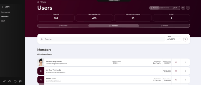
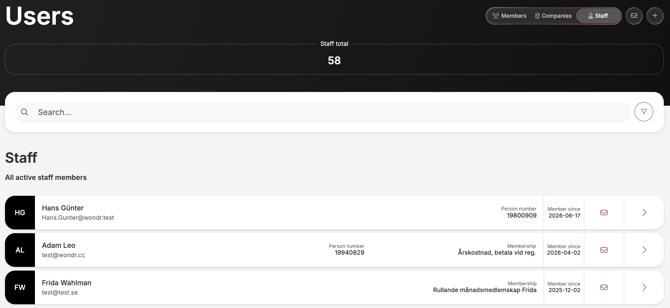
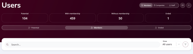
At the top of the page, you'll find three tabs: Members, Companies, and Staff. Each tab shows a tailored summary for that user type. In the Members view, for example, you see a breakdown of Potential, With membership, Without membership, and Ended — giving you an instant overview of your member base without having to run a report. The Staff tab shows a simple Staff total count instead.
Below the summary, a segmented bar lets you switch between sub-views — for example Potential, Members, and Ended — so you can quickly drill into a specific group.
Searching for users
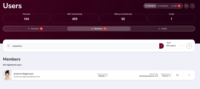
The search bar sits at the top of the user list. Start typing a name, email, or person number and results appear instantly below.
When you search, red notification badges appear on any tab or sub-view that has matching results. This makes it immediately clear whether you'll find the person under Members, Companies, or Staff.
Filtering users
Next to the search bar you'll find a filter button (the funnel icon). Click it to expand the full filter panel.
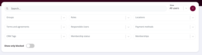
The filter panel gives you nine filter options: Groups, Roles, Locations, Terms and agreements, Responsible Users, Payment methods, CRM Tags, Membership status, and Memberships. You can also toggle Show only blocked to quickly surface blocked users.
Previously, these filters were always visible on the page. They're now tucked behind the filter button, keeping the interface clean and uncluttered until you need them.
Top-right actions
In the top right corner of the Users page you'll find two buttons that work the same way as before: the envelope icon sends a message to all users currently matching your active filter or view, and the + button creates a new user profile. These are always visible regardless of which tab you're in.
The user list - new look, same information
The user list has been redesigned from the ground up. Previously, users were displayed in a dense table showing columns like first name, last name, birthdate, address, postal code, city, and subscription — with a blue eye icon to open the profile.
The new list uses a cleaner card-style layout. Each row shows:
- Profile photo or initials
- Name and email address
- Person number (partially masked for privacy)
- Membership type
- Member since date
- An envelope icon — new in this version — to send a message directly to that user without opening their profile
The result is a much easier-to-scan list that surfaces the most relevant information at a glance, with quick access to messaging any individual user directly from the list.
Creating a new user profile
Click the + button in the top right to create a new profile. The type of profile created depends on which tab you're currently in — if you're in Members, the form opens as a customer profile; in Staff, it opens as a staff profile; in Companies, as a company profile.
Previously, you created a profile first and then selected a role. That step is now gone — the tab you're in determines the profile type automatically.
NOTE: You can only create the profile type that matches your current tab. If you're in the Staff tab, you cannot create a member profile from there. Go to the correct tab first.
The fields in the form vary depending on the profile type. Staff profiles include additional fields for information that feeds directly into the schedule and the staff presentation block on your Wondr website — for example bio, title, and contact details.
Company profiles include fields for organisation number and company-specific details instead of personal information.
The user profile - header and quick actions
Opening a user profile takes you to a completely redesigned page. The header gives you a full overview of the person at a glance.
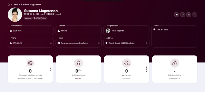
At the top you see the user's profile photo, full name, date of birth with age, and partially masked person number (click the eye icon to reveal it). Below the name, any tags or groups assigned to the user are shown as chips — for example "customer" or "Weight Trainer."
Directly beneath the header, key profile details are displayed in individual cards: Member since, Gender, Assigned Staff, Note, Phone, Email, and Address. Phone, email, and address each have a copy icon so you can grab the information instantly without opening the edit view.
In the top right corner, four action buttons give you quick access to the most common tasks:
- Wei — opens Wondr's mass editing agent for bulk actions on this user
- Message — sends a message directly to the user
- Checkout — takes you to the checkout to sell a product or create a manual order
- Three-dot menu — opens a dropdown with additional options
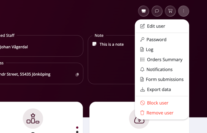
The three-dot menu contains: Edit user, Password, Log, Orders summary, Notifications, Form submissions, and Export data. At the bottom, Block user and Remove user are shown in red.
Activity overview cards
Below the header, four summary cards give you a snapshot of the user's engagement:
- Weeks of workout streak — how many consecutive weeks the user has logged at least one workout
- Achievements — how many achievements the user has earned out of the total available, with a "View all" link
- Workouts this month — total workouts logged in the current month
- Lifetime Value — coming soon
Memberships
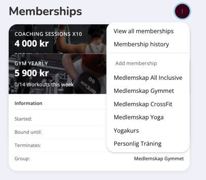
The Memberships section has been completely redesigned. Active memberships are now displayed as a visual card carousel — each card shows the membership name and price, along with a progress indicator where relevant.
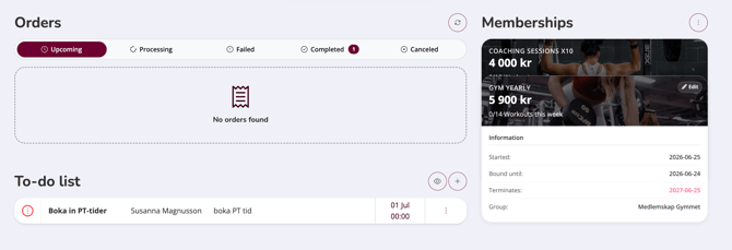
If the user has more than one active membership, the cards stack behind each other. Click a card in the back to bring it to the front and view its details. Below the carousel, the Information panel updates to show the details for whichever membership is in front: start date, binding period, termination date, and membership group.
The three-dot button in the top right opens a menu with three options: View all memberships for a full list, Membership history to see past memberships, and Add membership to assign a new one directly from the profile — with your available membership types listed immediately below for quick selection.
Orders
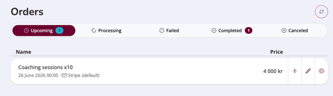
The Orders section has a refreshed look but works much the same as before. Orders are organised across five tabs: Upcoming, Processing, Failed, Completed, and Canceled. Tabs with orders show a count badge so you can see at a glance where activity is.
Each order row shows the name, date, and payment method. Click a row to expand it and see the full details: item, order number, date, payment method, status, and price.
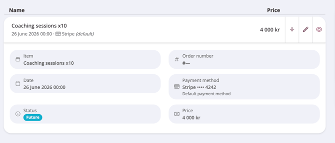
On each order row you'll also find three action icons: a split icon to divide the order (only visable if applicabable), a pencil icon to edit it, and an eye icon to view the full order detail.
To-do list
The To-do list shows all to-dos assigned to this specific user. Each row displays the task title, the user it's assigned to, a description, and the due date. A red icon indicates overdue or high-priority items.

Click the circle to the left to complete the to-do. Click the + button to add a new to-do directly from the profile. Click the eye icon to access the full system-wide to-do list across all users.
Activity timeline
The Activity timeline is entirely new and replaces the old Bookings section on the profile. Rather than showing only bookings, it brings together everything that has happened with this user in one chronological feed.
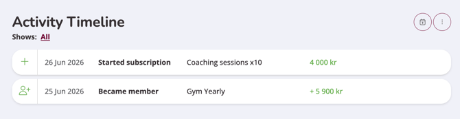
Each entry shows the date, event type, relevant details, and where applicable a value in green. Click Shows: All to filter the timeline by activity type — you can select one or multiple: Member events, Subscription events, Bookings, Check ins, Product purchases, and CRM Activities.
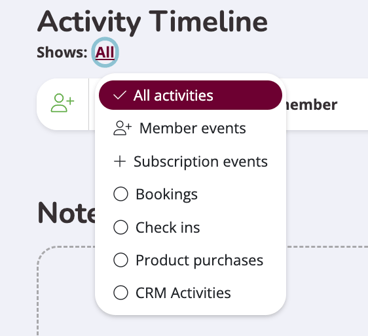
In the top right, the calendar button opens the booking window so you can book the user onto an activity directly from their profile. The three-dot button gives you quick access to Check ins and Booking history.
Pott accounts
The Pott accounts section follows the same card carousel pattern as Memberships. If the user has multiple pott accounts, they stack behind each other — click a card in the back to bring it forward.
The front card shows the account type and available balance. Below it, the account details are shown by default: balance including reserved amounts, expiry date, creation date, and whether auto subscriptions are enabled.
Click Tap to see transactions to switch to the transaction view, which shows recent activity with deductions in red and refills in green.
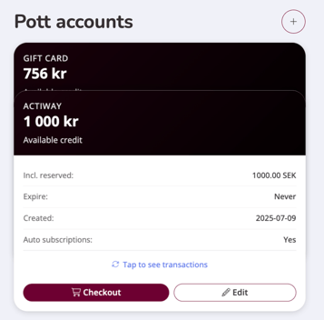
From the detail view you can go directly to Checkout to use the account for a purchase, or click Edit to update the account settings.
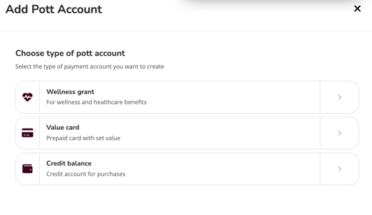
Click the + button to add a new pott account. You'll be asked to choose the account type: Wellness grant (for wellness and healthcare benefits), Value card (prepaid card with set value), or Credit balance (credit account for purchases).
Payment methods
Payment methods follow the same card carousel pattern. The front card shows the payment method type and key details — click a card in the back to bring it forward.
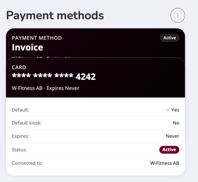
Below the active card, the details are shown: whether it's set as the Default payment method, whether it's the Default kiosk method, the Expiry, Status, and which facility it's Connected to.
Click the three-dot button to view all payment methods or add a new one. The available payment method types depend on your country and which payment integrations you have set up in Wondr.
Notes
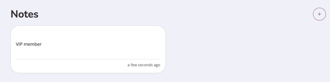
The Notes section displays all notes logged on this profile. Each note shows the content, the staff member who wrote it, and the timestamp. Click + to add a new note directly from the profile.
Files and Documents
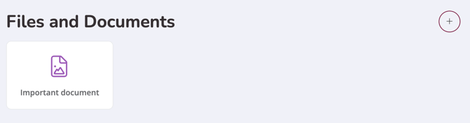
Files and documents attached to the user's profile are displayed as thumbnail cards. Click + to upload a new file.
Agreements
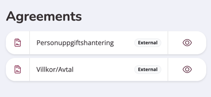
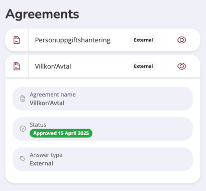
The Agreements section shows which terms and agreements the user has signed. Click the eye icon to expand an agreement and see the full details: the agreement name, approval status with date, and answer type.
-
External means the agreement was signed outside of Wondr — this is set when a staff member manually registers the user and selects "User has signed outside of Wondr."
-
Internal means the user signed digitally, either by signing up themselves or because the staff member chose "The user has to sign online through app or web browser" when creating the profile.
Access keys & Entry groups
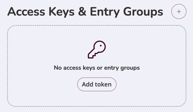
Here you can see and manage any access keys or entry groups assigned to the user. If none have been added yet, the section displays a prompt to Add token. Click + to add a new access token.
Latest year costs
This section only appears if the user has paid a year cost on any membership. It shows the item name, date, order number, and amount. Click the eye icon to view the full order details.

Last edited: 26-06-2026