Table of contents:
Introduction
In the Dashboard menu, you can easily switch between:
- Wondr Wall
- Today
- User activity
- Leads & prospects
- Members
- Economic
You switch between these options in the Dashboard menu, which in browsers is found at the top right and in mobile as an extra menu above the regular navigation. See images below.
With Dashboard, you get better visibility, can make faster decisions and drive your business forward with more confidence and clarity. Here you get the tools to see patterns, discover opportunities and create profitability.
In this article we will go through all the menu options above and what information you can find.
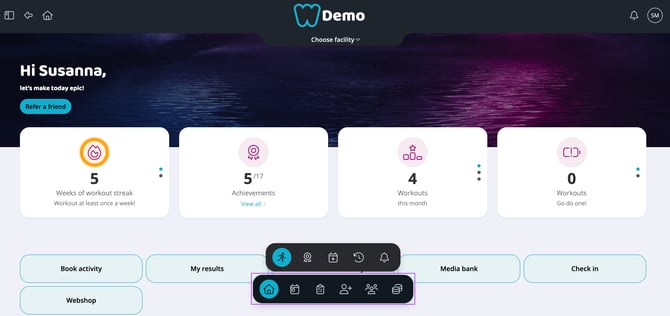
Image 1: The browser menu
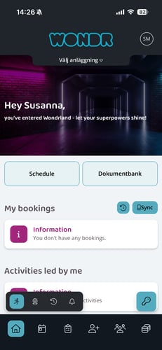
Image 2: The menu in the app
Dashboard
Wondr Wall is the customers' view and the place where you can, for example, book your own training sessions and follow your training achievements and streaks. This view is therefore not for managing the schedule as a staff but for example for booking a place if you are going to participate in an activity privately.
Here you will also find all buttons and shortcuts that have been activated for customers, such as "Open door, Media bank, form notification, etc."
This is the only view of the Dashboard that customers can access. The remaining menu options are for staff and admin only.
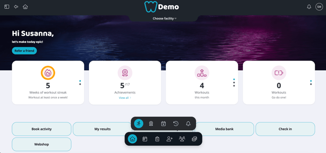
Image 3: Wondr Wall
Today
Four squares
This is where your day is summarized and important information is displayed in a simple way.The first four squares show the following:
- Staff streaks: Shows statistics on how many weeks in a row you have led an activity at the facility.
- Staff achievements: Shows your completed staff achievements.
- Your to-dos: Here you will find a summary of all CRM To-Dos assigned to you. Today, this week, month and total number closed. Click in the box to scroll.
- Your led activities: Statistics on how many activities you have led this month, this year and historically. Click in the box to scroll.
My activities today
Here you see all the activities you are responsible for today.
My tasks/to-do
Here you will see all the to-do/tasks from CRM assigned to you. Here is an explanation of everything you can do!
-
Click on the row to expand the tasks and get more info. Here you can also easily postpone the task for a certain time by clicking on the different time options
-
Click the circle on the far left to check off a to-do. This will bring up a menu with options for history, notes, and whether to create a new task when closing it.
-
Click on the pushpin icon to pin this task to the top of the list.
-
Click on the pencil icon on the far right to edit the task.
-
Click on the plus sign at the top right to create a brand new task.
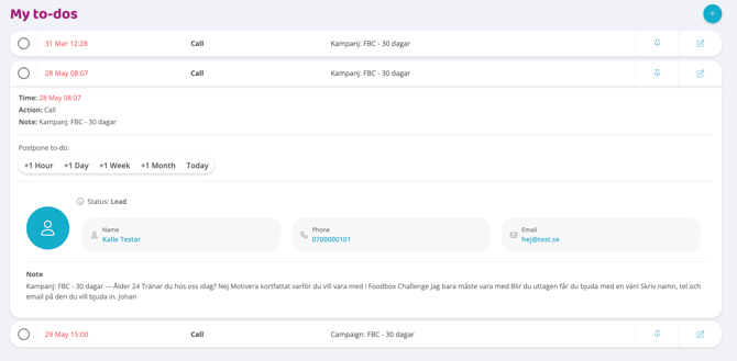
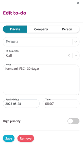
Image 4 & 5: Adding and editing to-dos
My prospects
Here you will see a list of all the prospects assigned to you and can manage them. Here is an explanation of everything you can do!- Click on the prospect row to get more information.
- Click on the icon with a calendar and a plus sign to create a task linked to this prospect.
- Click on the dots on the far right to get more options such as editing tasks, deleting prospects, creating a task, and going to CRM profile.
- Switch between the person and high-rise icons to see prospects linked to private individuals or company profiles.
- Click the plus sign to add a new prospect to the list.
NOTE: The difference between leads and prospects in Wondr is that a prospect is assigned to a responsible person in the CRM while a lead is not assigned to anyone. A prospect has thus come a little further in the sales process as it has a responsible person from the staff assigned to its CRM profile for a lead that no one has yet "taken hold of".
Unassigned leads
Here is a list of all leads in the system that have not been assigned to a responsible person. The leads may have come in from an active campaign in the Marketing Hub, your website if you have it via Wondr, or they may have been added manually by staff at an event or similar. Here is an explanation of everything you can do!- Click on the lead's row to get more information.
- Click on the icon with an old man and a plus sign to assign this lead to yourself. The lead will then become a prospect and be moved to the top list of your prospects.
- Click on the dots on the far right to get more options such as editing tasks, deleting leads, creating a task, and going to CRM profile.
- Switch between the person and high-rise icons to see leads linked to individuals or business profiles.
- Click the plus sign to add a new lead to the list.
New and lost members
Two lists showing the most recently added members and those who have terminated their membership. There are currently no choices here, only information such as the name of the person and the date they became a member/terminated and a smooth summary.
User activity
Four squares
This shows a summary of important data for who is currently at the facility and the day's various activities.
NOTE: In order for numbers to be displayed here, you need to have check-in active for your members, either automatically when the door opens, via the app or check-in station.
- Today's total: This number shows how many people checked in to your facility throughout the day (both open gym and booked activities).
- Gym sessions: Shows how many people only checked in to the gym/personal training during the day.
- Class check-ins: Shows how many people checked in to a booked activity during the day.
- Currently checked in: Shows how many people are currently checked in at the facility

Image 6: View of User activity page
Latest check-ins
A list of the people who have most recently checked in to your facility. You will see the name, check-in time, facility, time and date.
Red warning triangle: The time and date will turn red and a warning triangle will appear if the check-in failed. Click on the line to see the error message and find out what went wrong.
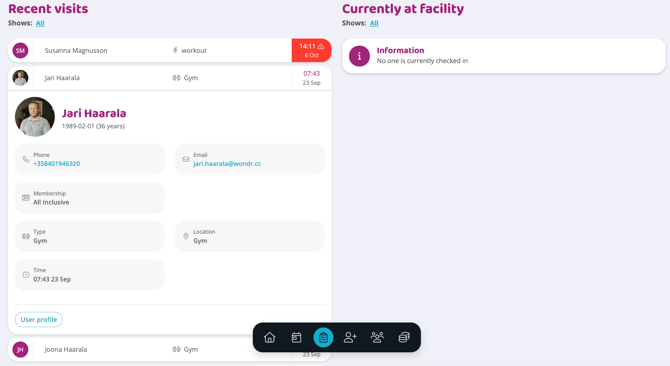
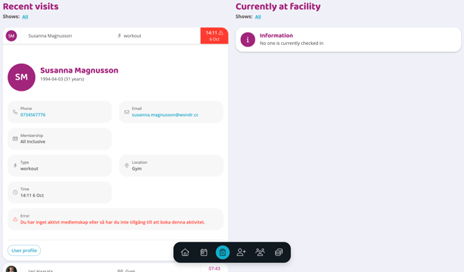
Image 7 & 8: Different user activity views
Located on the facility
Here is a list of those currently at the facility. You can set how long a visitor is considered checked in in Settings. People will then be automatically removed from this list a set amount of time after checking in, so this number is not exact but is an estimate based on how long your members usually stay at the facility.
Leads & Prospects
Under the header, you can change which period you want to see data for.You can choose between the intervals: This week, this month, this year, the last 7 days, the last 30 days and the last 365 days.
The period you choose affects which figures are presented:
This X (e.g. this month, this year, this week): Means that we count the current period in its entirety (e.g. all of June, all of the year, all of the week).
Last X (e.g. last 30 days): This means that we count from today's date and X number of days back. This period is then compared to the previous period of the same length.
For example:
- If you select
This month, the result is compared to the previous month. - If you select
This year, the result will be compared to the previous year. - If you select
Last 30 days, the result is compared to the 30 days preceding the selected period.
Three squares
Generated leads: Shows how many leads have been generated during the current month.Converted membersand prospects: Converted members are how many prospects have been converted to a member profile and converted leads are how many have had a responsible person assigned to their profile and become a prospect.
NOTE! The difference between leads and prospects in Wondr is that a prospect is assigned to a responsible person in the CRM while a lead is not assigned to anyone. A prospect has thus come a little further in the sales process as it has a responsible person from the staff assigned to its CRM profile for a lead that no one has yet "taken hold of".
- Try it: Shows how many people participated in a "try it session" during the current month.
NOTE: For this number to work, you need to have the "Try it" feature active on at least one activity in the schedule.
Homepage
This modal only tracks information from websites built in Wondr via theMarketing Hub. If you have an external website that is not built in Wondr, you cannot retrieve data here.- Number of visitors shows how many visits the website has had in total in the current month and whether there is an upward or downward visitor trend.
- Leads over time shows how many leads to CRM the website has generated in the current month and whether there is an upward or downward trend.
Leads from website
This modal only tracks information from websites built in Wondr via the Marketing Hub. If you have an external website that is not built in Wondr, you cannot retrieve data here.
Here you will see a summary of the leads that have come in via the website with information about each person.
Switch between different statuses to see which people are currently leads or filter on profiles that have been converted to prospects or members but who all came in via the website from the beginning.
Here you can easily assign the lead to yourself by clicking on the icon with an old man and a plus sign, then you can click on the dots on the far right to get more options such as editing details, deleting prospects, creating a task and going to CRM profile.
Campaigns
This modal only tracks information from campaigns created in Wondr via the Marketing Hub. If you have external campaigns that were not created in Wondr, you cannot retrieve data here.
Here you can choose between seeing data for all campaigns or for a specific campaign. Select a campaign by clicking on the far right under the heading Show and instead of all, select a specific campaign. Then you will only see data for that specific campaign.
- Number of visitors: Shows the total number of visitors to all campaigns or a specific campaign depending on the filtering selection.
- Number of leads: Shows how many leads the campaign has converted via the "Lead to CRM" button function on all campaigns or a specific campaign depending on filtering selection.
Campaign leads
Here you will see a summary of the leads that have come in via campaigns with information about each person.
Switch between different statuses to see which people are currently leads or filter on profiles that have been converted to prospects or members but who all came in via campaigns from the beginning.
Here you can easily assign the lead to yourself by clicking on the icon with an old man and a plus sign, then you can click on the dots on the far right to get more options such as editing details, deleting prospects, creating a task and going to CRM profile.
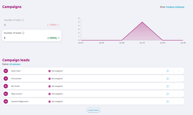
Image 9: Campaigns statistics and campaign leads
Try it
This shows the people who have tried an activity with you, with information and the time they tried it.
For data to appear here, the function "Add trial / non-members to CRM when booked" must be activated under Settings>CRM and then of course there must be activities with trial enabled that can be booked in the schedule.
Other leads
This shows all other leads that were not received via campaigns or the website. Just like in other lead lists, you can edit the lead, go to the profile, etc.
You can also filter here by leads and those that have been converted to prospects and members.
Members
Under the header, you can change which period you want to see data for.You can choose between the intervals: This week, this month, this year, the last 7 days, the last 30 days and the last 365 days.
The period you choose affects which figures are presented:
This X (e.g. this month, this year, this week): Means that we count the current period in its entirety (e.g. all of June, all of the year, all of the week).
Last X (e.g. last 30 days): This means that we count from today's date and X number of days back. This period is then compared to the previous period of the same length.
For example:
- If you select
This month, the result is compared to the previous month. - If you select
This year, the result will be compared to the previous year. - If you select
Last 30 days, the result is compared to the 30 days preceding the selected period.
Three squares
- Bookings: This shows how many activities have been booked in the current period (the period is controlled by the selection you made at the top under the heading).
- Frozen members: Shows how many members currently have frozen memberships
- Avg. membership duration: Shows the average length of time a person has been a member at your facility.
This figure is calculated based on all users with active memberships. We calculate the average of each user’s total membership duration, expressed in days.
If a member has had multiple membership periods (for example, if they cancelled and later rejoined), these periods are combined in the calculation. Any gap during which the person did not have an active membership is excluded.
Time during which a membership has been frozen is included in the membership duration, as the membership is still considered active.

Image 10: Member statistics
Member statistics
Depending on which of the choices below you click on, that is the data that is shown in the graph on the right.- Active members: Shows how many active members you currently have and whether there is an upward or downward trend.
- New members: Shows how many new members you have gained during the current period and whether there is an upward or downward trend.
- Terminated members: Shows how many members have terminated their membership during the current period and whether there is an upward or downward trend.
Membership
This graph shows the distribution between all different memberships. You see how many people currently have the membership active on their profile and then what percentage this membership represents of the total. You also see an arrow showing whether this membership is increasing or decreasing in popularity.
Activity types
This graph shows how many bookings each activity type has and what proportion of all booked activities this activity represents. This means you can easily see which are your most booked activities and which are not booked as frequently.
At the top right you can also filter by specific instructor activities. Initially it says Showing: All, but just click on All and you can select a specific instructor.
Membership changes
Here you can see the latest changes among members and their membership. Changes can be a new member, a frozen membership, a terminated membership, etc.
At the top right you can also filter by specific events. Initially it says Showing: All, but just click on All and you can choose between several specific changes.
In the list you will see the date of the change, what happened, the name of the member, which membership was acquired/terminated and what this means for sales.
On the far right, you can also create a CRM task for the person.
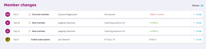 Image 11: Membership changes
Top 10 active members
This list shows the members who are most active at the facility. You can switch between those who check in most often and those who book the most activities.
Economic
Under the header, you can change which period you want to see data for.You can choose between the intervals: This week, this month, this year, the last 7 days, the last 30 days and the last 365 days.
The period you choose affects which figures are presented:
This X (e.g. this month, this year, this week): Means that we count the current period in its entirety (e.g. all of June, all of the year, all of the week).
Last X (e.g. last 30 days): This means that we count from today's date and X number of days back. This period is then compared to the previous period of the same length.
For example:
- If you select "This month", the result is compared to the previous month.
- If you select "This year", the result will be compared to the previous year.
- If you select "Last 30 days", the result is compared to the 30 days preceding the selected period.
Three squares
- Lifetime Revenue per Member: This figure represents the average amount each member generates over the entire time they are a member. When we talk about customer value, we use ARM (Average Revenue / Member) rather than the broader term Lifetime Value. To calculate ARM, we include only paying members and only revenue from paid orders/memberships, not our entire total turnover.
The formula for ARM is: Total paid turnover/Number of active paying members
- Average membership fee: This shows your average monthly cost for all memberships. This figure is based solely on active paying members and should not be equated with an average price for credits, as these are two different types of revenue.
- Failed payments: This shows how many failed payments there are currently.
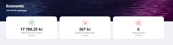 Image 12: Economic statistics
Economic overview
In this section you can choose between viewing the data as a line chart or a bar chart. You also have the option to click on several of the values at the same time to compare them in the graphs.
-
Total turnover: Shows the total turnover (both plus and minus items are included here) for the selected period.
-
Turnover: Shows how much money has been received during the selected period.
-
Upcoming: Shows the total for all upcoming orders for the selected period.
-
Unpaid: Shows how many unpaid orders there are during the selected period.
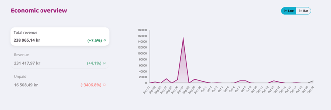 Image 13: Economic overview
Sold memberships
This shows the memberships sold during the selected period. The name of the membership, how many have been sold, and the income the sales have generated.
Sold products
This shows the products sold during the selected period. The name of the product, how many were sold, and the income the sales generated.
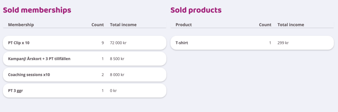 Image 14: Sold memberships and products
Failed payments
This is a list summarizing the most recent failed payments.
You will see the following information:
-
The date the order failed and the order number
-
Customer name
-
Which payment method the order has attempted to be charged to
-
The amount for the failed order
You also have two buttons on the far right of each order line:
-
Eye: Click here to go directly to the order and manage it (reactivate for new drawing attempts, cancel, etc.)
-
Add To Do/Task: Create a task in your CRM such as handling orders later, calling the customer, emailing the customer, etc.

Image 15: List of failed payments
Last updated: 17/2-2026